Nov 28, 2023
Design Your ServiceBell Widget to Demand Attention From Visitors
Edit your ServiceBell widget’s design to grab visitors’ attention and hook them into a warm conversation.
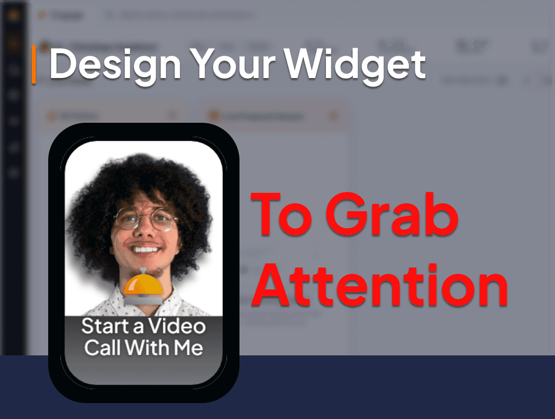
Most chatbots get ignored.
But ServiceBell is more than a basic chatbot. It acts like the front desk of your office — giving prospects the chance to ask their questions to real human beings…

Don’t let visitors ignore your ServiceBell widget.
Here’s how to edit your widget’s design to grab visitors’ attention and hook them into a warm conversation.
Getting Started
To edit your widget design just click “Settings” → “Designer”
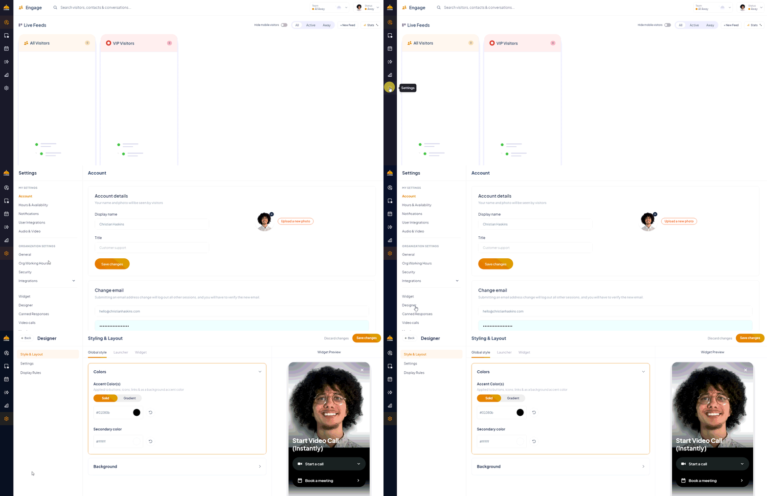
There are 3 side tabs in the widget designer:
“Style & Layout” ← Used to edit the look and defaults of your widget
“Settings” ← Used to configure email requirements and which locations to show the widget
“Display Rules” ← Used to control what exact conditions to show your widget

We’ll spend most of our time in the “Style & Layout” tab.
How to Design an Eye-Catching Widget
Most chatbots get ignored.
You’re fighting an uphill battle to grab the visitor's attention and get them to engage with you. You need to show the visitor that the widget isn’t just another automated chatbot.
You want to make them feel like the widget is the front desk of your office. Where they can go for help, questions, and support. Here’s how:
Use a Video Background to Demand Attention
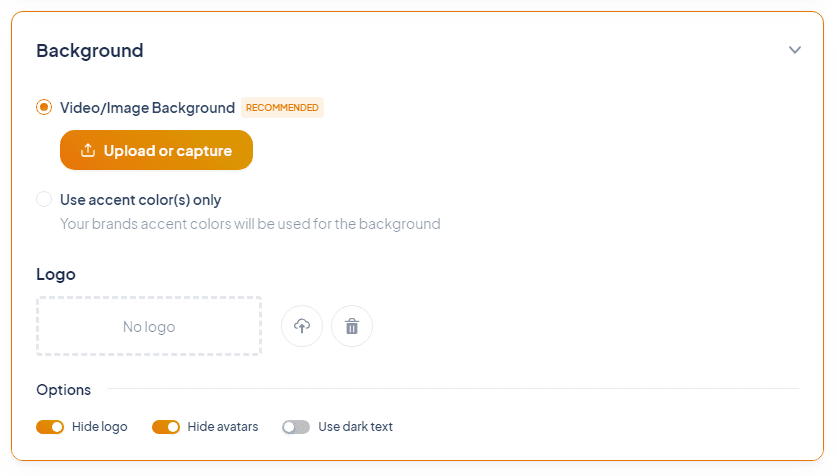
You have 3 options for the background of your widget:
Video & Image Background ← Recommended
Image Background ← Good enough
Blank Color Background ← Awful
If you want to demand the visitor's attention — use the video background and upload a high-quality video of you waving at the camera (show your chest and up).
You can also get creative with this video greeting to grab more attention. Think about using an interesting backdrop, wearing funny accessories, making a confused face → then smiling, etc.
If you can consistently make visitors giggle with this video, YOU’RE GOLDEN.
You need to balance catching the visitor off guard without looking crazy.
Pick Your Widget Brand Colors
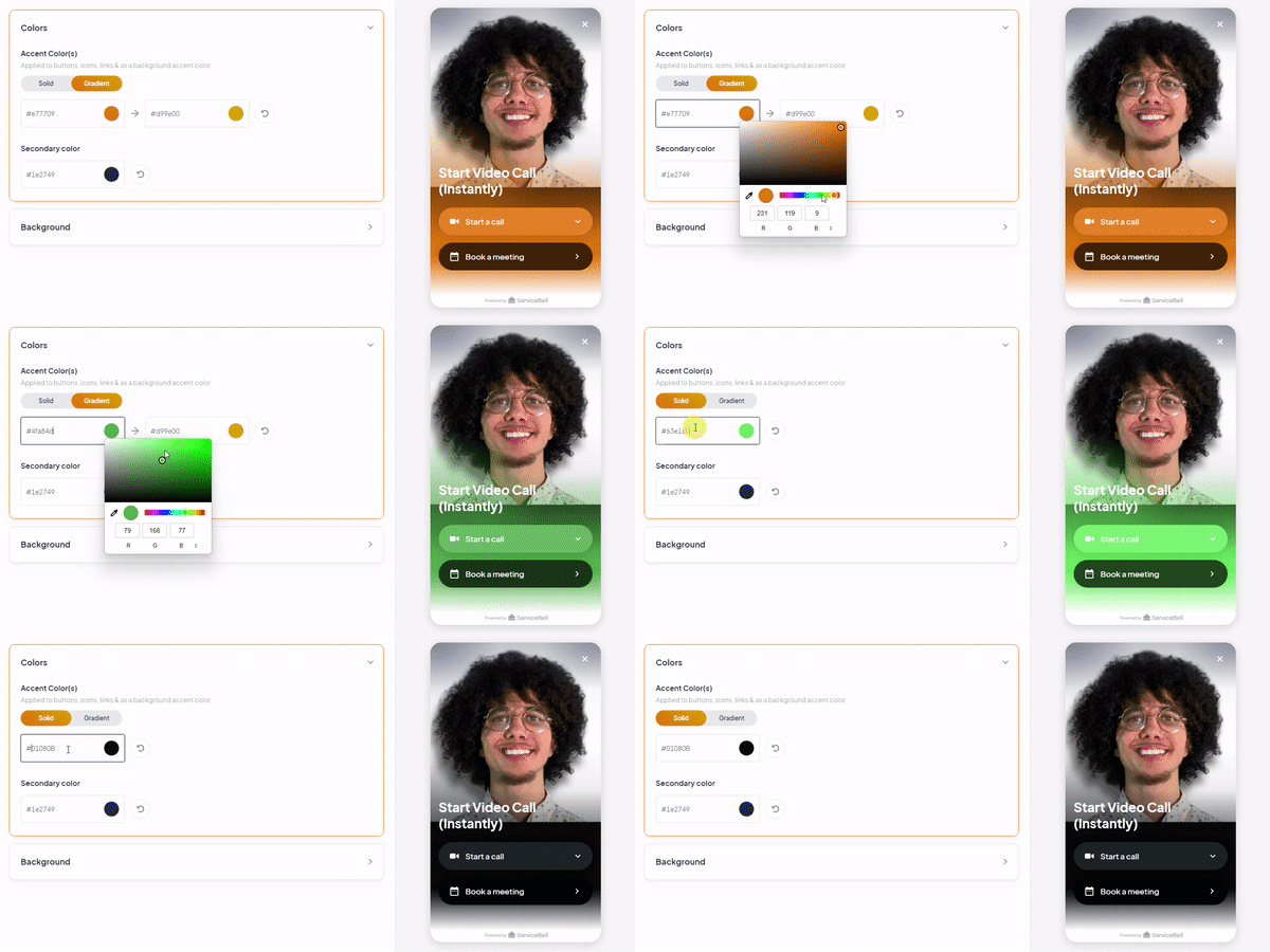
This part is pretty straightforward.
The only tricky bit is picking the right brand color to use as your primary widget color. You’ll have to experiment with different colors/accents and see which ones work the best with your widget’s image. You might have to edit the image to make it work with certain colors.
Other Background Settings
Here are some lesser-used widget settings. You can leave most of these defaults — but experimenting with them won’t hurt.
Launcher → Customize Layout:
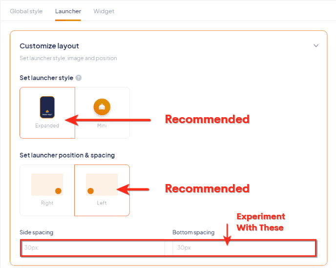
Customize your launcher’s style, positioning, and spacing.
Global style → Background → Options:
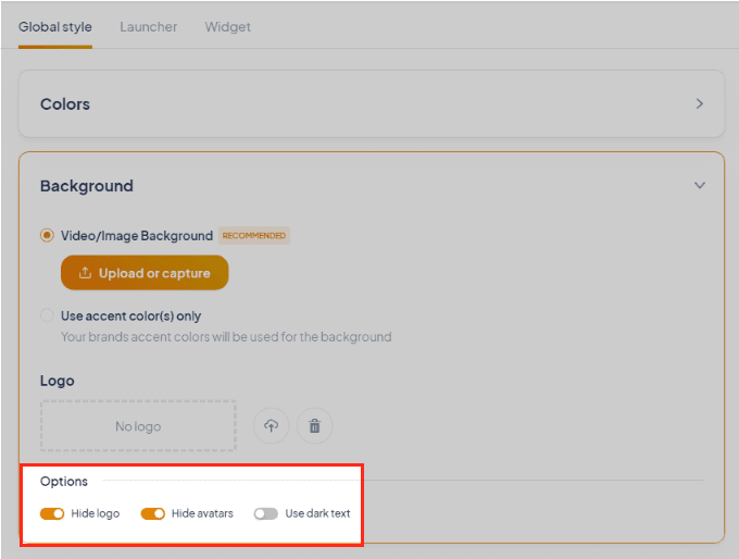
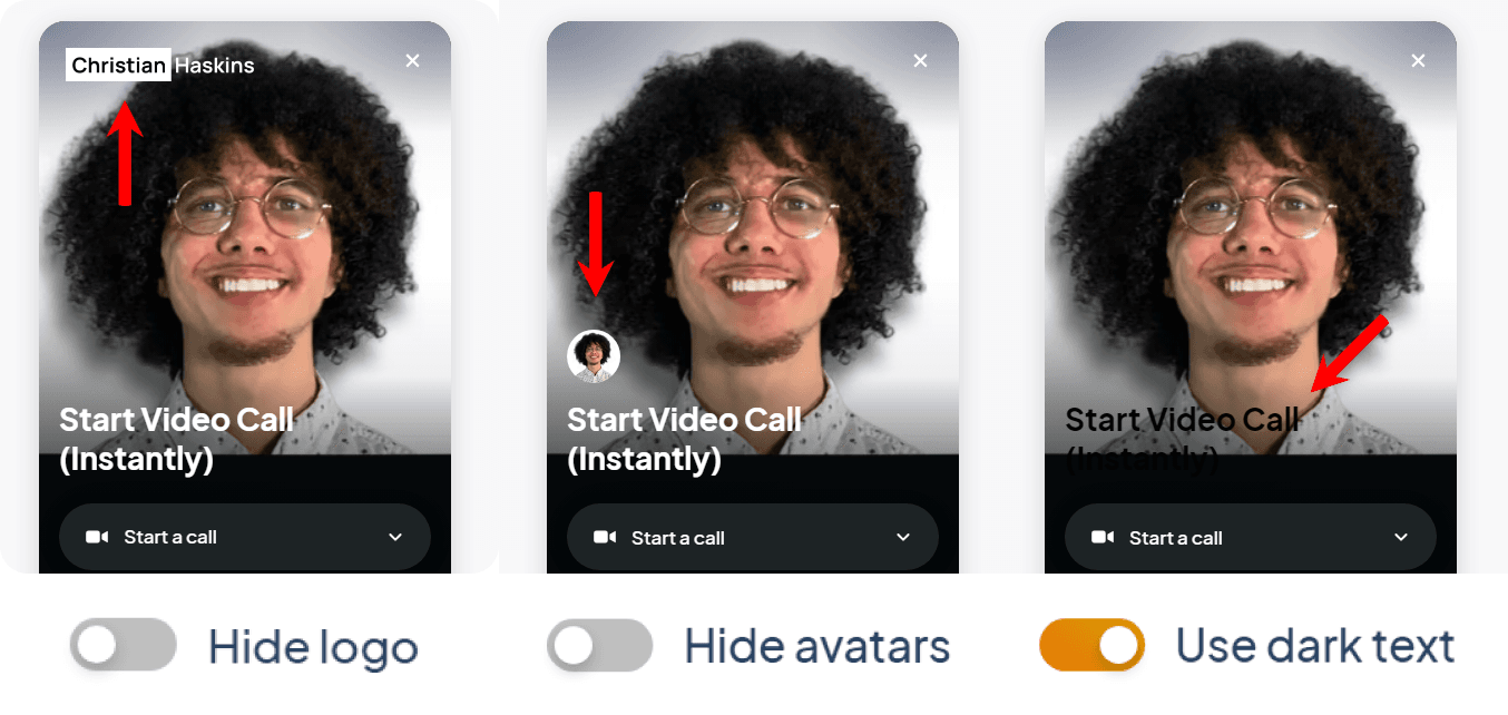
Most of these options are self-explanatory.
Create an Enticing Launcher Message
This is one the of most important parts of your widget. These messages can make or break your engagement rate. There are 2 types of messages you can customize — the default message and the hover message:
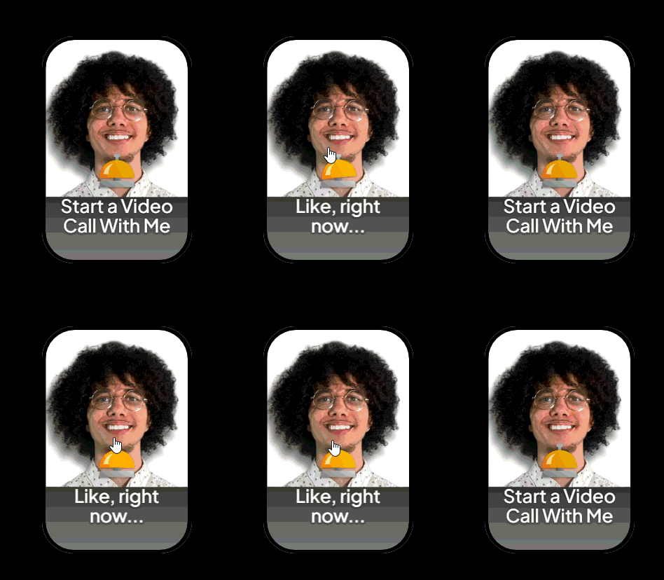
The default message is your hook. It should give visitors a short and crystal-clear call-to-action. For example:
“Call or Chat Now”
“Discover Instant Demos”
“Speak with Our Experts”
“Connect Via Live Video Call”
The hover message is a gentle nudge. It should expand on your default message and overcome simple objections. For example:
Default Message: “Call or Chat"→ Hover Message: “With a Live Rep”
Default Message: “Get an Instant Demo”→ Hover Message: “Without Leaving Our Website”
Your launcher message can also change based on your team's availability:
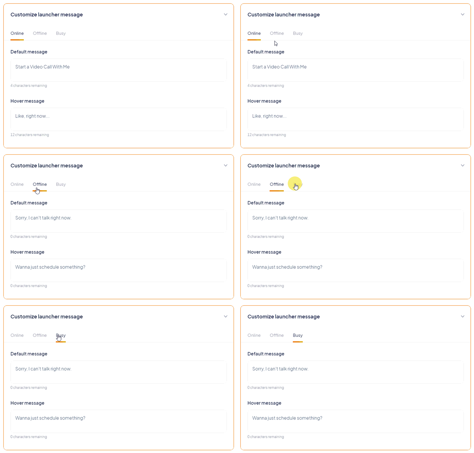
For Online→ Your goal is usually to get them to speak to a live agent.
For Offline/Busy→ Your goal is usually to get them to book a future meeting.
Setup Your Widget Call-to-Actions & Header Text
Your widget’s header text is what’s shown to visitors AFTER your widget is expanded. You’ll want to use this text to nudge them toward your most desired call-to-action.
This header text can also change based on your team’s availability.
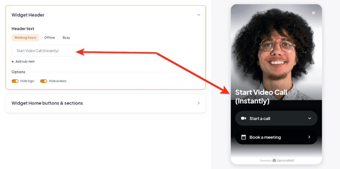
You can pick and choose from 3 primary CTA buttons that display once the widget is expanded. You can also add a custom link at the bottom of these CTAs. If you want to show visitors their conversation history — you can toggle that here.

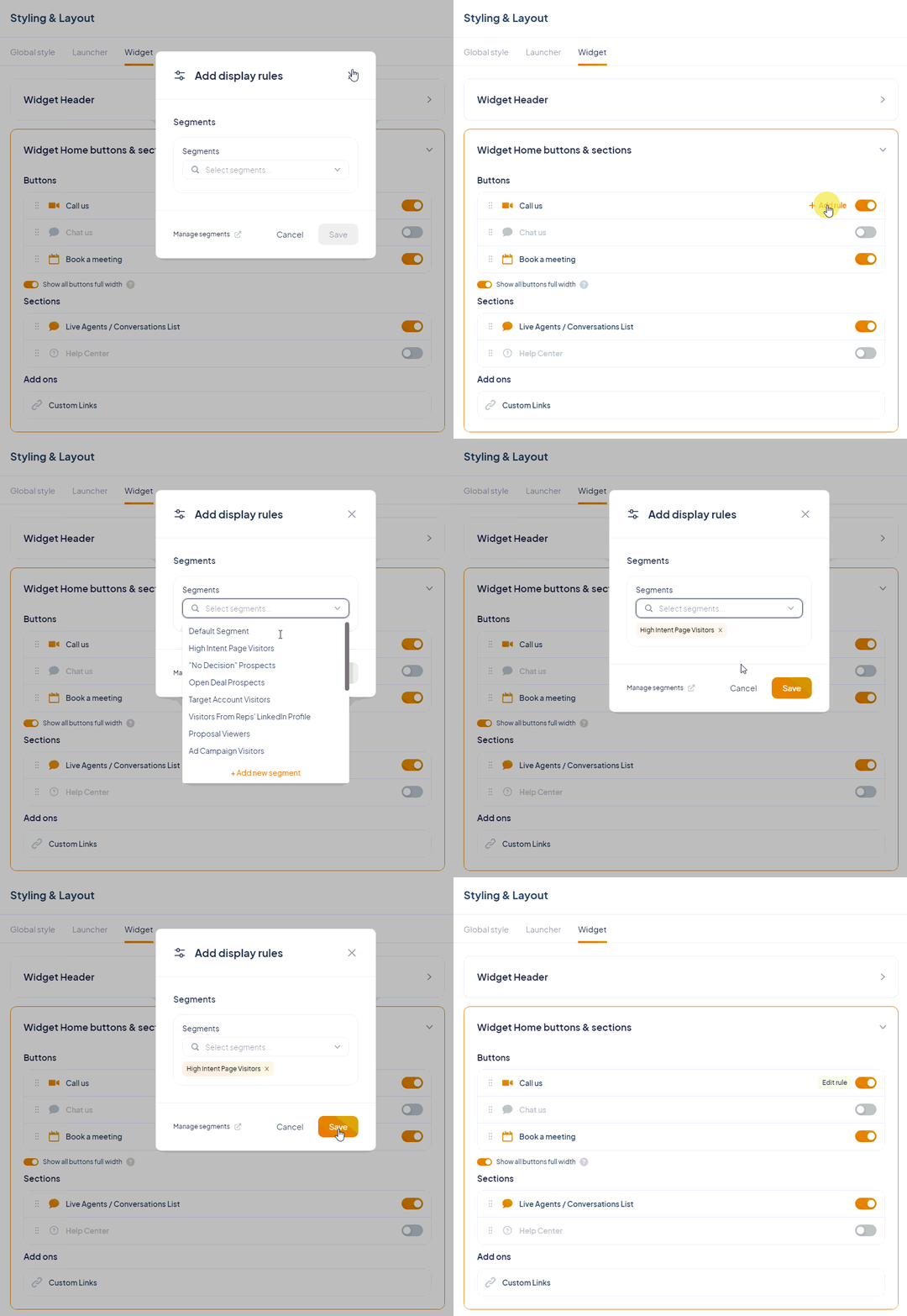
You can also conditionally display CTAs to visitors based on what segment they’re in. Just hover over the CTA and click “Add rule” → then pick whatever visitor segment you’d like.
Control Exactly When Your Widget is Displayed
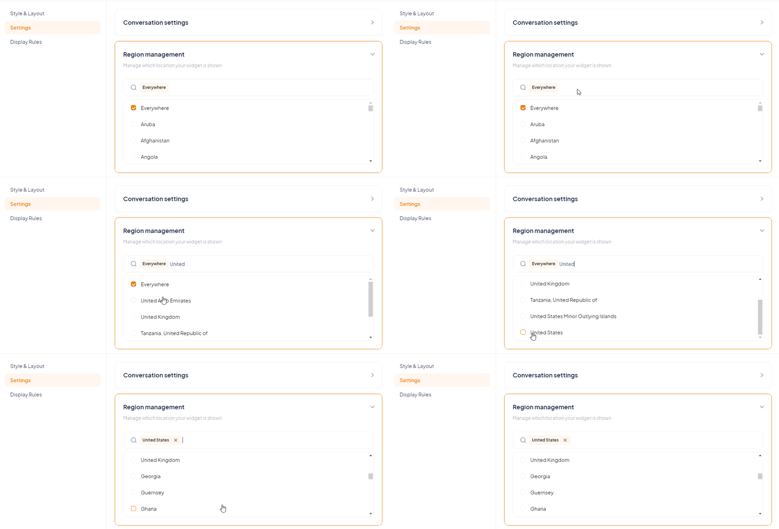
You can control the specific geographic locations that can see your widget in the designer “Settings” tab:
You can also create conditional rules that control when the widget is shown, its position, its style, and whether it’s expanded by default — under the “Display Rules” tab:
